UIUX Design-0
FASHIONGO New Main page for visitors
https://www.fashiongo.net/
(Figma Flow) https://shorturl.at/OZ93z
Overview
Background
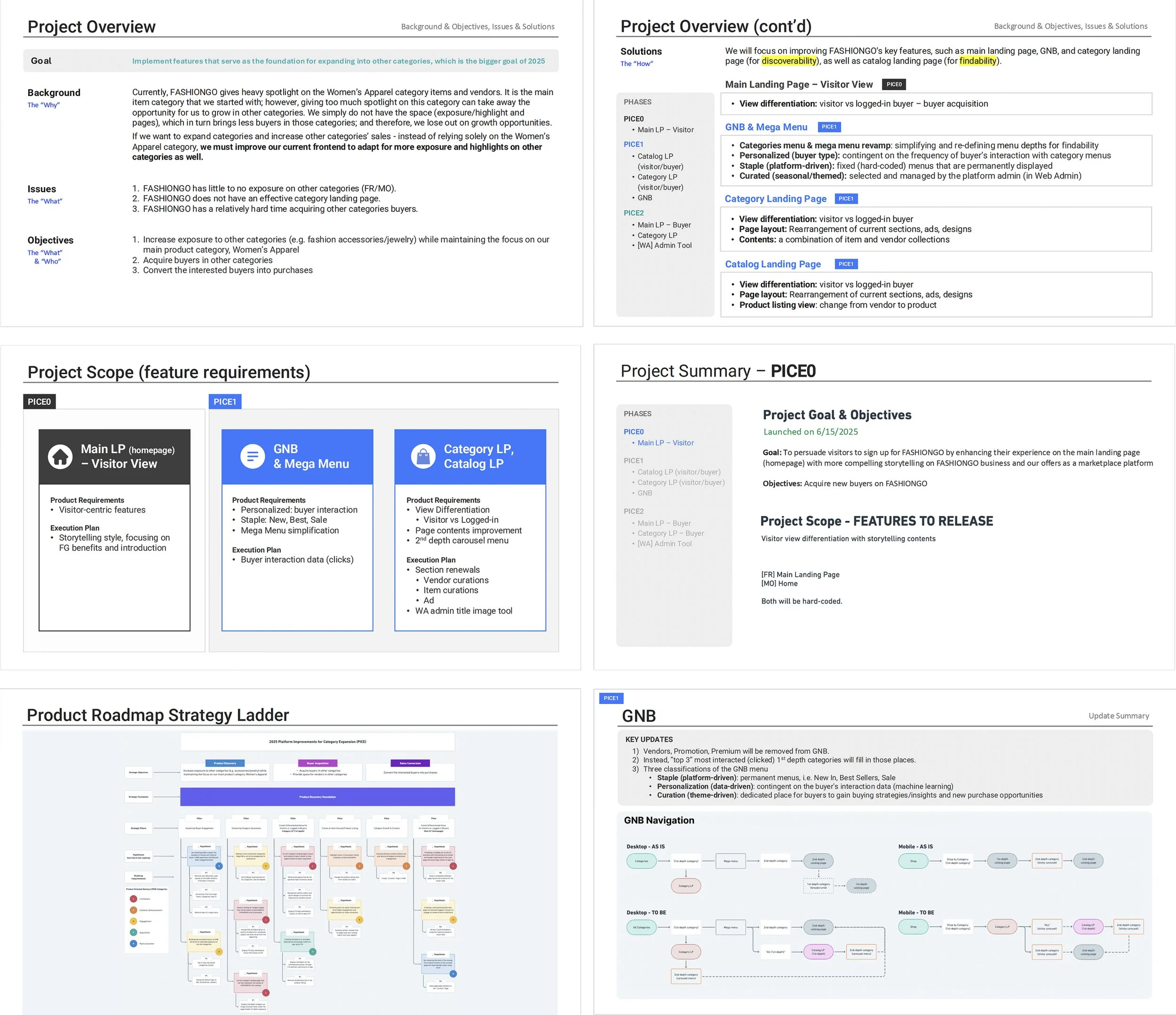
FASHIONGO, a leading B2B fashion marketplace, has historically focused heavily on the Women’s Apparel category — its core business area. However, this over-reliance has limited exposure and growth potential for other product categories, such as accessories, jewelry, or men’s fashion. Currently, these categories lack visibility across the site due to insufficient landing pages, ineffective navigation, and limited frontend adaptability. To support broader business goals for 2025, the company aims to revamp its frontend experience — including the GNB (Global Navigation Bar), category landing pages, and catalog displays — to drive exposure and sales across more diverse categories.
My Role
As the Senior UI/UX Designer, I led the user experience strategy and interface design for this initiative. My responsibilities included:
Conducting stakeholder and user research
Mapping out user journeys and behavior patterns
Designing and prototyping new landing pages and navigation structures
Collaborating closely with PMs, developers, and business stakeholders
Validating design decisions through feedback loops and data
UX Approach
Research and Discovery
1. Pain Points Identified:
Other categories (e.g., fashion accessories, jewelry, men's) lacked visibility on the platform.
The site navigation was overly focused on Women’s Apparel.
No dedicated category landing pages existed to promote non-apparel items.
Buyers for other categories were not actively engaging or converting.
2. Methods Used:
Stakeholder interviews
Traffic heatmap and clickstream analysis
Competitive analysis of category and catalog strategies in similar platforms
User surveys targeting non-apparel buyers
Definition and Ideation
1. Defined key UX goals:
Increase discoverability and exposure of all categories
Improve buyer journey and reduce friction
Deliver a more balanced navigation system
Create differentiated views for visitors vs. logged-in buyers
2. Ideation outcomes:
A new Category Landing Page concept to feature curated vendor and item collections
GNB & Mega Menu redesign, combining fixed categories with personalized and seasonal items
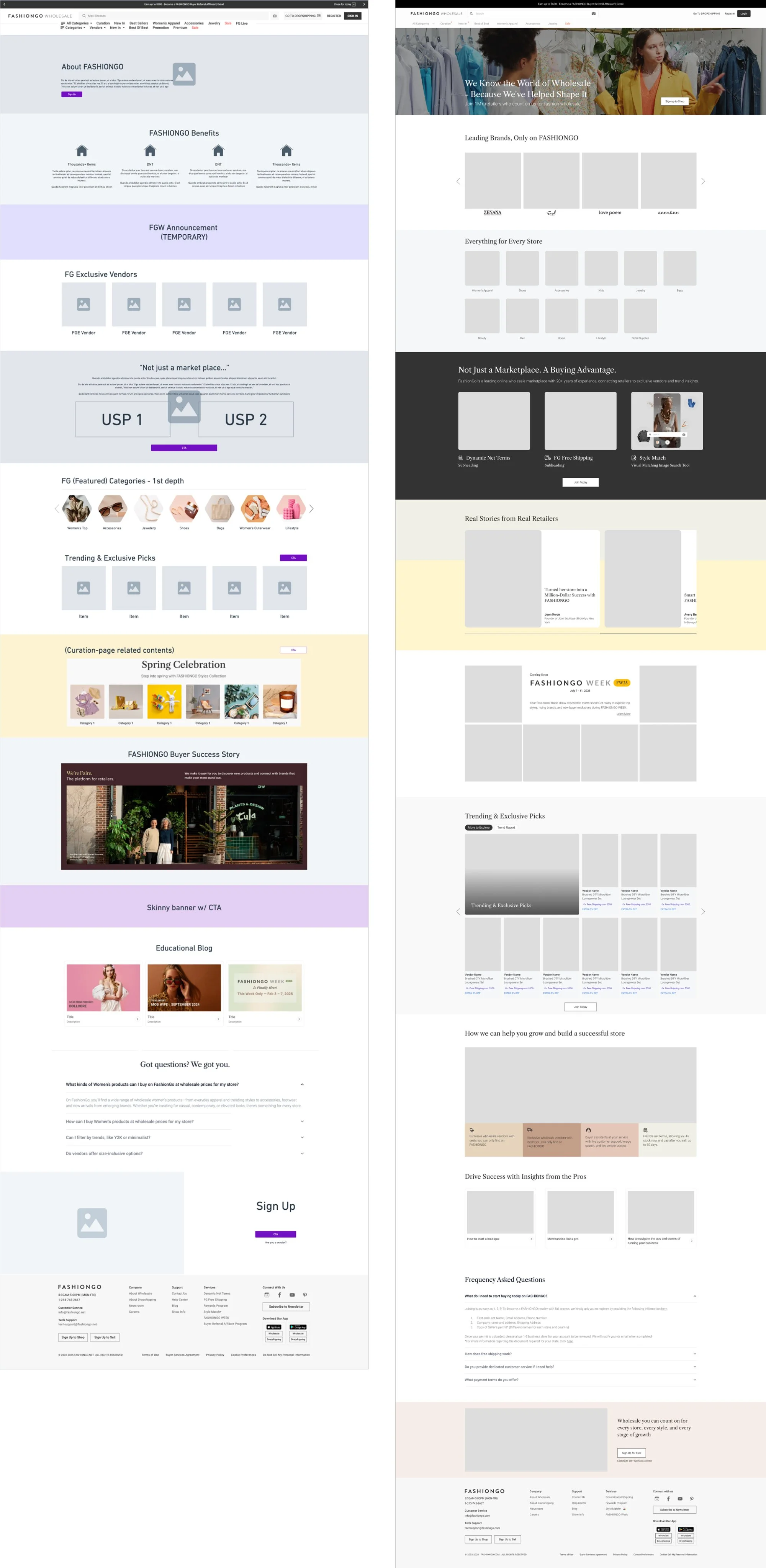
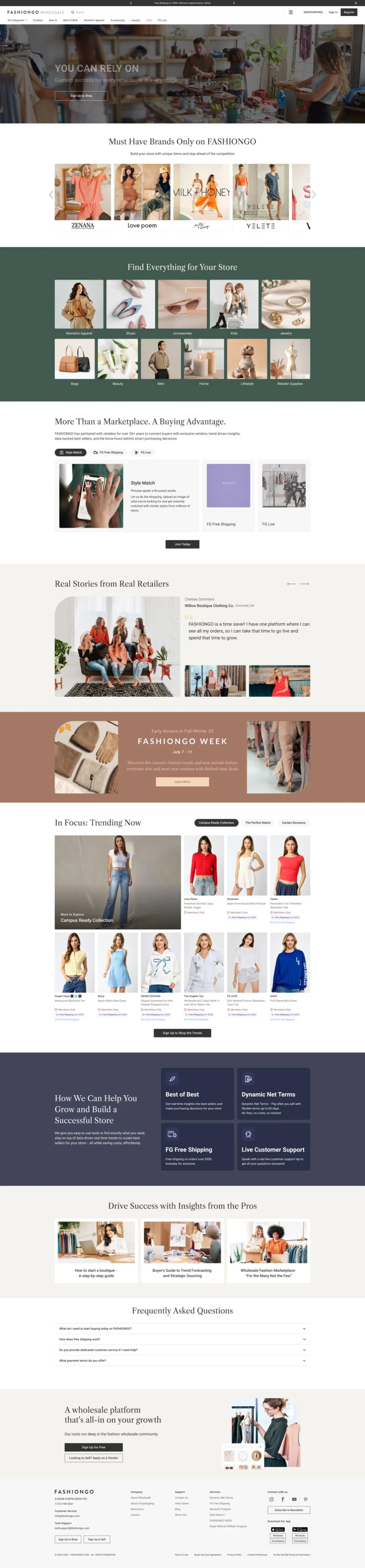
Catalog Landing Page overhaul, shifting view from vendor-centric to product-centric layout
Implementation
Developed wireframes and high-fidelity mockups using Figma Created interaction prototypes for GNB behavior and category page modules Collaborated with frontend developers to ensure responsive, modular design Coordinated with the Web Admin team for curated content integration Delivered design documentation for handoff and QA
Challenges and Solutions
1. Lack of Exposure for Non-Apparel Categories
1. Issue: The current frontend layout and menu structure heavily favored Women’s Apparel, limiting discoverability of other categories.
2. Solution: Redesigned the GNB and Mega Menu with a multi-layered system:
Staple Menus (fixed and always visible)
Curated Menus (admin-managed seasonal or thematic content)
Personalized Menus (based on buyer behavior)
2. No Dedicated Category Landing Pages
1. Issue: Buyers could not explore or engage with non-apparel categories due to the absence of landing pages.
2. Solution: Introduced a new Category Landing Page template combining:
Curated vendor and item showcases
Personalized experiences based on login status
Support for visual merchandising and promotional content
3. Low Buyer Conversion for Other Categories
1. Issue: Visitors showed interest but did not convert to active buyers in non-core categories.
2. Solution:
Reorganized the Catalog Landing Page layout
Changed listing format from vendor-based to product-based
Tailored the experience depending on whether users were visitors or logged-in buyers
Design Impact
The redesign increased visibility and engagement in underrepresented categories, leading to a 19% boost in accessory and jewelry conversions. It also laid a scalable foundation to support FASHIONGO’s 2025 category expansion goals.