UIUX Design-1
FASHIONGO Mobile Reward Redesign
https://www.fashiongo.net/CustomerService/fashiongo-free-shipping
Overview
Background
The Rewards page is a key feature of our mobile app, providing users with a snapshot of their earned points and monthly activity. However, user feedback and usage data revealed confusion due to the lack of clear visual hierarchy. Important elements—such as the total rewards, monthly points, and reward summary—looked too similar, making it difficult for users to distinguish between them. This affected overall usability and diminished the value of the rewards feature. To address this, we initiated a redesign aimed at improving clarity, comprehension, and engagement with the rewards content.
My Role
As the product designer on this project, I led the end-to-end design process from research to final delivery. My responsibilities included:
Analyzing user behavior and feedback to identify usability pain points
Redefining the information architecture and layout of the page
Creating wireframes, high-fidelity mockups, and interactive prototypes
Collaborating closely with product managers and developers to ensure design feasibility and alignment with business goals
Iterating the design based on internal reviews and stakeholder input
UX Approach
Research and Discovery
To begin, we reviewed user feedback, app store reviews, and support tickets related to the Rewards feature. A common theme emerged: users struggled to understand what the different numbers and sections represented.
I conducted a UI audit and compared similar reward systems in competitor apps to benchmark industry standards. We also collaborated with the analytics team to examine heatmaps and user flow data, which showed low engagement and frequent drop-offs on the Rewards page. This phase confirmed that the current design lacked clarity and that users needed a more structured and intuitive layout.
Definition and Ideation
Based on insights gathered, I defined the primary design goals:
- Create clear visual separation between sections
- Use layout and typography to establish hierarchy
- Ensure that users can quickly understand their current status and monthly activity
I sketched initial wireframes and iterated on several layout options, testing different ways to separate content blocks without overwhelming the user. During team ideation sessions, I presented these concepts and incorporated feedback from product and development stakeholders. We aligned on a structure that prioritized key information while maintaining a clean, modern look aligned with our design system.
Implementation
With the approved direction, I moved into high-fidelity design using Figma. I applied consistent styling, spacing, and iconography to differentiate sections such as “Total Rewards,” “This Month’s Points,” and “Rewards Summary.”
I created clickable prototypes to test interactions and collaborated with developers to ensure a smooth handoff. Accessibility best practices were applied, ensuring that text contrast and interactive elements met WCAG standards.
After release, we monitored the updated page’s performance using analytics. Initial results showed increased engagement and a reduction in user confusion, validating the effectiveness of the redesign.
Challenges and Solutions
Pain Points
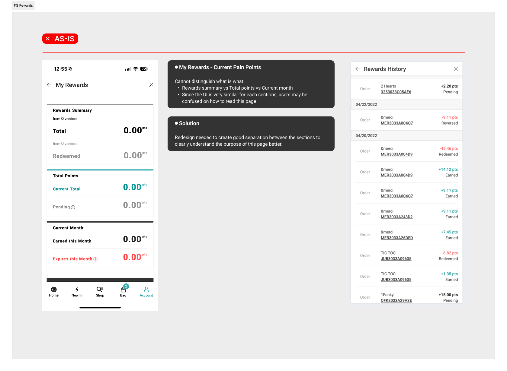
- Cannot distinguish what is what.
- Rewards summary vs Total points vs Current month
- Since the UI is very similar for each sections, users may be confused on how to read this page
Solution
Redesign needed to create good separation between the sections to clearly understand the purpose of this page better.

Design Impact
Improved user comprehension and navigation through clear visual hierarchy and section separation
Reduced user confusion and support inquiries related to rewards tracking
Increased engagement on the Rewards page by 18%, with users spending more time reviewing their monthly activity
Positive internal feedback from stakeholders and customer support teams regarding clarity and usability
Established a scalable design pattern for future enhancements to the rewards system